
Tuesday, 6 July 2010
Seasons and Time
Seasons of time one really interesting acrylic on canvas representing seasons with an abstract way. The colour pattern that the artist used is really interesting and really clear for the viewer to understand the season theme. However the artist in order to make the time more obvious divided the canvas in three sections and a face appear all over the canvas which it looks almost like a hidden theme.

Hidden themes
Hidden messages is information that is not immediately noticeable, and that must be discovered or uncovered and interpreted before it can be known. Hidden messages include backwards audio messages, hidden visual messages and symbolic or cryptic codes such as a crossword.
Nursery rhymes
Nursery rhymes reflect events in history and where available we have included the meanings, history and origins. Like for instance 'Ring a Ring o Rosies' which refers to the Bubonic plague. However nursery rhymes lyrics were used to parody the royal and political events of the day; direct dissent would often be punishable by death! Strange how these events in history are still portrayed through children nursery rhymes, when for most of us the historical events relationship to the nursery rhymes themselves are long forgotten! The Rhyme allowed an element of free speech.
Also Mary, Mary, Quite Contrary rhyme which featured a hidden reference to the Queen's treatment of Protestants using instruments of torture (silver bells) and execution by burning them alive at the stake.
Tord Boontje
Tord Boontje was born in enschede, netherlands in 1968 and he studied industrial design. He explores cues from nature, rich coloration and visual layering to create lyrical and highly-detailed objects.
His work is layered. The layers shift, sometimes its really pretty and uplifting, sometimes its more dark and scary like a scary story, like an alfred hitchcock film! Sometimes its very floral and sometimes its much cooler and reduced and abstract.
I find his work really inspiring as it has more potential for typography and visual graphic design.


Peter Callesen
Danish artist Peter Callesen makes amazing sculptures from paper.
I really like the simple whiteness and complexity of his work. Of course, the more complicated papercut sculptures will tend to impress most viewers because of the high level of skill and craft needed to make them. However is really impressive how with a piece of paper can create master simple designs.I think it takes more courage as an artist to exhibit very minimal work,the less you have, the more focus there is on it and the more exact it needs to be.
I really like the simple whiteness and complexity of his work. Of course, the more complicated papercut sculptures will tend to impress most viewers because of the high level of skill and craft needed to make them. However is really impressive how with a piece of paper can create master simple designs.I think it takes more courage as an artist to exhibit very minimal work,the less you have, the more focus there is on it and the more exact it needs to be.


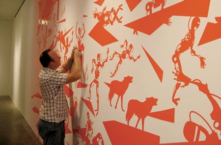
Typography Master
Alex Varanese draws upon a limitless supply of cheeky quips designed specifically for ironic post-hipster posturing.
However he has a unique approach with typography and a fascination with red colour. I find his work really strong of the way that designs typography and send the message to the viewer.

However he has a unique approach with typography and a fascination with red colour. I find his work really strong of the way that designs typography and send the message to the viewer.

Pippo Lionni
Pippo Lionni was born in 1954. Grew up in a New York family of architects, escaped into Philosophy and Mathematics at Portland State University and New York University, played jazz in New York and Paris, and became a designer in the late 1970’s. He brings to design a conceptual approach, of diversified influences as formalized in complex multidimensional systems: such as signage, scenography, corporate identity programs, environmental design...


Subscribe to:
Posts (Atom)